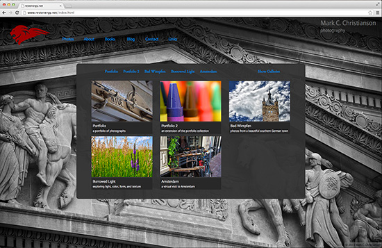
My main website, restenergy.net, has received a thorough update. I’m hoping my new page will better feature my photography; look cleaner, sleeker, and more inviting; and have an interface that is easier to navigate.
Improvements
I’ve incorporated larger thumbnails and pages that display all of the photographs in a set without needing to figure out not-so-obvious navigation systems. You can also see larger versions of the photos by clicking on a thumbnail. Gone is the somewhat clunky Flash plugins for display of the photographs. So the new website should also play nice with tablets and other mobile devices which don’t support Flash-based material. Menu items at the top of the page will take you to various pages of content, and the photo galleries have a submenu for easy navigation between various galleries and back to the gallery thumbnail page (seen in the screenshot above). Smother transitions between sections of the website should also be seen, as whole pages no longer need to load for each section. Lastly, clicking on my name in the upper right will reload the whole page and allow you to view one of the screen-wide background photos without the intrusion of other content.
Newsletter
I’ve also launched a new newsletter system. If you’d like occasional updates of new photographs on the main website and other news related to my photography, or would like updates on recent posts to the blog you might have missed, please sign up for the newsletter through the form in the right hand column of this blog, or by finding the link to sign-up on the contact or about page of restenergy.net.
You’re Invited to Pay a Visit
Please take some time to visit the main restenergy.net website and take a look around the improved website and photo galleries.

Leave a Reply